After.Video at Libre Graphics 2016 in London

banner_glitch_1

Recently, I posted about a project called after.video, which contains an augmented (AR) glitch/video/image-based theory piece that Karin Denson and I collaborated on. It has now been announced that the official launch of after.video, Volume 1: Assemblages — a “video book” consisting of a paperback book and video elements stored on a Raspberry Pi computer packaged in a VHS case, which will also be available online — will take place at the Libre Graphics Meeting 2016 in London (Sunday, April 17th at 4:20pm).

Interactivity and the “Video Essay”

paradoxes-of-suture1

Recently, I posted a video essay exploring suture, space, and vision in a scene from Nicholas Roeg’s Don’t Look Now (1973). Following my video essay hijab.key, which experimented with dirt-cheap DIY production (namely, using Apple’s Keynote presentation software instead of the much more expensive Adobe Premiere Pro or Final Cut Pro for video authoring), the more recent video, “Don’t Look Now: Paradoxes of Suture,” was also an experiment in using splitscreen techniques for deformative purposes, intended to allow the viewer to alternate between “close” (or focused) and “distant” (or scanning, scattered) viewing modes.

What I have begun to realize, however, is that these videos are pushing at the boundaries of what a “video essay” is or can be. And I think they are doing so in a way that goes beyond the more common dissatisfactions that many of us have with the term “video essay” — namely, the questionable implications of (and formal expectations invoked by) the term “essay,” which apparently fails to describe many videographic forms that are either more poetic in nature or that indeed try to do argumentative or scholarly work, but whose arguments are less linear or explicit than those of traditional essays. These are good reasons, I think, to prefer a term like “videographic criticism” (except that “criticism” is perhaps too narrow) or “videographic scholarship” over the more common “video essay.”

But these recent pieces raise issues that go beyond such concerns, I suggest. They challenge the “videographic” part of the equation as much as, or even more than, the “essayistic” part. Take my “Don’t Look Now” video, which as I stated is designed to give the viewer the opportunity to experiment with different ways or modes of looking. By dissecting a scene into its constituent shots and laying them out in a multiscreen format, I wanted to allow the viewer to approach the scene the way one looks at a page of comics; that is, the viewer is free to zoom into a particular panel (which in this case is a looping video clip) and become immersed in the spatiotemporal relations it describes, only then to zoom back out to regard a sequence, row, or page of such panels, before zooming back in to the next one, and so on. Thus, two segments in the recent video consist simply of fifteen looping shots, laid out side by side; they are intended to give the viewer time to experiment with this other, less linear mode of looking.

But the video format itself is linear, which raises problems for any such experiment. For example, how long should such a splitscreen configuration be allowed to run? Any answer will be arbitrary. What is the duration of a page of comics? The question is not nonsensical, as cartoonists can establish rhythms and pacings that will help to determine the psychological, structural, or empirical duration of the reading experience, but this will never be an absolute and determinate value, as it is of necessity in the medium of video. That is, the linear format of video forced me to make a decision about the length of these segments, and I chose, somewhat arbitrarily, to give the viewer first a brief (30 sec.) glance at the multiscreen composition, followed later (after a more explicitly argumentative section) by a longer look (2 min. at the end of the 9 minute video). But since the whole point was to enable a non-linear viewing experience (like the non-linear experience of reading comics), any decision involving such a linearization was bound to be unsatisfactory.

One viewer commented, for example:

“I think the theory is interesting but why the lengthy stretches of multi shot with audio? Irritating to the extent that they detract from your message.”

Two important aspects come together in this comment. For one thing, the video is seen as a vehicle for a message, an argument; in short, it is regarded as an “essay.” And since the essayistic impulse combines with the video medium to impose a linear form on something intended as a non-linear and less-than-argumentative experimental setup, it is all too understandable that the “lengthy stretches” were found “irritating” and beside the point. I responded:

“For me the theory [of suture] is less interesting than the reading/viewing technique enabled by the splitscreen. I wanted to give the viewer time to make his or her own connections/alternate readings. I realize that’s at odds with the linear course of an ‘essay,’ and the length of these sections is arbitrary. In the end I may try to switch to an interactive format that would allow the viewer to decide when to move on.”

It was dawning on me, in other words, that by transforming the Keynote presentation into a video essay (using screen recording software), I had indeed found an interesting alternative to expensive video authoring software (which might be particularly valuable for students and other people lacking in funding or institutional support); at the same time, however, I was unduly amputating the interactive affordances of the medium that I was working in. If I wanted to encourage a truly experimental form of vision, then I would need to take advantage of precisely these interactive capabilities.
DontLookNow-ParadoxesOfSuture-INTERACTIVE-Standalone-2016-02-16.

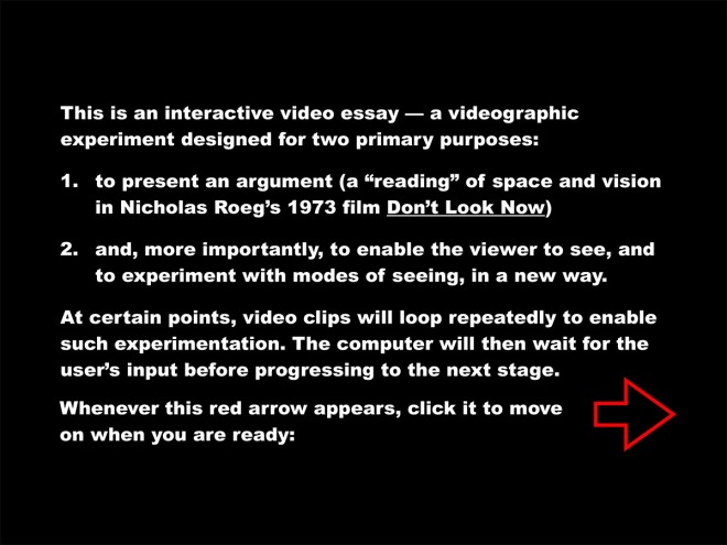
Basically, a Keynote file (like a PowerPoint presentation) is already an interactive file. Usually the interactivity is restricted to the rudimentary “click-to-proceed-to-the-next-slide” variety, but more complex and interesting forms of interaction (or automation) can be programmed in as well. In this case, I set up the presentation in such a way as to time certain events (making the automatic move from one slide to another a more “cinematic” sequence, for example), while waiting for user input for others (for example, giving the user the time to experiment with the splitscreen setup for as long as they like before moving on). You can download the autoplaying Keynote file (124 MB) here (or by clicking on the icon below) to see for yourself.

icon128-2x

Of course, only users of Apple computers will be able to view the Keynote file, which is a serious limitation; ideally, an interactive video essay (or whatever we decide to call it) will not only be platform agnostic but also accessible online. Interestingly, Keynote offers the option to export your slideshow to HTML. The export is a bit buggy (see “known bugs” below), but with some tinkering you can get some decent results. Click here to see a web-based version of the same interactive piece. (Again, however, note the “known bugs” below.)

HTML5_Logo_256

In any case, this is just a first foray. Keynote is probably not the ultimate tool for this kind of work, and I am actively exploring alternatives at the moment. But it is interesting, to say the least, to test the limits of the software for the purposes of web authoring (hint: the limits are many, and there is constant need for workarounds). It might especially be of interest to those without any web design experience, or in cases where you want to quickly put together a prototype of an interactive “essay” — but ultimately, we will need to move on to more sophisticated tools and platforms.

I am interested, finally — and foremost — in getting some feedback on what is working and what’s not in this experiment. I am interested both in technical glitches and in suggestions for making the experience of interacting with the piece more effective and engaging. In addition to the Keynote file and the online version, you can also download the complete HTML package as a single .zip file (66 MB), which will likely run smoother on your machine and also allow you to dissect the HTML and Javascript if you’re so inclined.

zip

However you access the piece, please leave a comment if you notice bugs or have any suggestions!

Known bugs, limitations, and workarounds:

  • Keynote file only runs on Mac (workaround: access HTML version)
  • Buggy browser support for HTML version:
    • Horrible font rendering in Firefox (“Arial Black” rendered as serif font)
    • Offline playback not supported in Google Chrome
    • Best support on Apple Safari (Internet Explorer not tested)
  • Haven’t yet found the sweet spot for video compression (loading times may be too long for smooth online playback)
Don’t Look Now: Paradoxes of Suture

An exploration of suture, space, and vision in Nicholas Roeg’s Don’t Look Now (1973), this video essay also experiments with close and distant modes of viewing. Made in Apple Keynote, screen recording done with ScreenFlow, and just a few finishing touches added with Final Cut Pro.

UPDATE: See here for an interactive version and for some more general reflections on interactivity and the “video essay.”

Out Now: [in]Transition 2.4

2016-01-04 01.02.49 pm

The latest issue of [in]Transition: Journal of Videographic Film & Moving Image Studies has just been published. This is a special issue featuring video essays that emerged out of the NEH workshop on videographic criticism that I attended last summer at Middlebury College, organized by Jason Mittell and Christian Keathley. In addition to my video essay “Sight and Sound Conspire: Monstrous Audio-Vision in James Whale’s Frankenstein (1931)” — with peer reviews by Steven Shaviro and Drew Morton — the special issue also contains great pieces by Allison de Fren, Patrick Keating, Jaap Kooijman, and Michael Talbott. Check it out!

Non-Diegetic Decapitation, or: The Animated Gif as Film-Theoretical Instrument

monster-entry

In my book Postnaturalism: Frankenstein, Film and the Anthropotechnical Interface, I follow Robert Spadoni in arguing that James Whale’s Frankenstein (1931) harnessed the energies of the recent transition to sound cinema, focusing them in the menacing figure of what Spadoni calls an “uncanny body.” I contend that Whale’s “capture” of these energies manifests itself,

above all, in the face of the monster, which, beneath the iconized veneer familiar to us all, undermines self-reflexivity of the conceptual sort with a non-reflective surface that refuses subjective correlation; the facial image, I wish to say, harbors a Teflon-like substrate to which phenomenological intentions just won’t stick. It is this substrate, this non-iconizable material excess of the monstrous facial image, that, in 1931, mediated the molecular force of transitionality.

To recover an experience of that visage, which would bring us face to face with the alien agency of Frankenstein’s filmic body, requires that we peel back the layers of popular-cultural associations that have accrued upon it over the years, that we rewind all the subsequent Frankenstein films and return to a situation prior even to Bride of Frankenstein’s melodramatic/ironic humanization of the face as the source of articulate words and expressive tears. We must try to imagine how terrifying the monster’s face was to its first audiences, who did not even have the comfort of a fixed genre label “horror” at their disposal with which to categorize, process, and thereby mitigate the disturbing nature of their experience. Indeed, this pre-stabilized horror film’s particular power to frighten was linked directly to the pre-iconic perception of the monster; as Spadoni points out: “How scary the film was on its first release is suggested by the fact that at that time, and unlike any time since then, the view of Boris Karloff’s monster as a sympathetic figure was not unanimously taken for granted” (93).

Clearly, there is no question of actually recovering the experience, or of seeing these images with the eyes of a spectator at a 1931 screening of the film. But, then again, I’m not quite sure what that would mean even if it were possible. For part of my argument about the “molecular force” of the image, which at some level “refuses subjective correlation,” is that horror was created here by bypassing conscious registration altogether. In this sense, then, there simply is no model spectator against which to measure my own experience of the images. Instead, if what I am suggesting makes sense, there is an experiential gap around which these images revolve and which they serve to invoke.

monster-face-cu

Thus, despite the monstrous facial image’s almost immediate degradation to a ubiquitous marketing gimmick, and despite the seemingly total transfer of its uncanny monstrosity to the diegesis (upon which basis Frankenstein served as a shining example for the subsequent generic stabilization of horror), it is possible, I maintain, to locate a gap in the net of textuality cast upon the image. In this gap, which is also a sort of hole in the narrative, the monster assaulted his first viewers with a physical shock, subject only to a visceral sort of processing, but which was just as quickly forgotten. Ground zero, where the impact of this experience is the greatest, and which marks a point of contact with an alien agency, is reached in the scene when the newly animated monster makes his first appearance onscreen.

All we can do, in other words, is circle around this “gap,” which I have done repeatedly in my work on Frankenstein, revisiting this scene over and over to think about it from all possible angles. But a “gap in the net of textuality” implies rather straightforwardly that, at least in certain respects, any textual description of the scene will necessarily be inadequate.

This is why, more recently, I have turned to videographic explorations of the images. My video essay “Sight and Sound Conspire: Monstrous Audio-Vision in James Whale’s Frankenstein” takes no fewer than three passes at the monster’s first appearance — without, however, stopping to dwell very long on the monster’s face and the breakdown of spatiotemporal relations that, I am suggesting, are occasioned by its first appearance. For my point, again, is that the forward motion of the film and its narrative is halted in its tracks, and a seemingly timeless space (or a non-spatialized duration) opens up and engulfs me, the viewer — though it all happens in the blink of an eye, so I may not be aware of anything beyond some vague feeling of dread or what we call “the uncanny.” Clearly, the seeming timelessness of the experience resists the linear exposition of the video essay as well, thus making repetition all the more necessary.

monster-face-xcu

I want to suggest, then, that perhaps the closest approximation of this experience of timelessness is to be found in the form of the animated gif, the repetitive looping nature of which quite literally rips the images out of their diegetic contexts, helping us to understand how

this scene establishes the very possibility of [the head’s] detachment by first exposing the head from all sides, thus turning it into an object per se rather than a flat image, and the cut-in to the close-up seals the deal by making the head emerge from the screen, separated from the monster’s diegetic body. This non-diegetic decapitation stubbornly resists integration as pertaining to “one diegetic subject,” but the experience also lays the necessary groundwork for its retroactive textualization. This, then, is the very genesis of the monstrous face’s iconicity, the initiation of a process that will turn that face, seen from whatever angle and from whatever distance, into a sort of eternal close-up.

Here, finally, is my attempt to “visualize” this experience — where the “objecthood” per se of the head as a detachable thing (abstracted from the narrative and made available as a three-dimensional image, instantly destined to become a Halloween mask) is rendered visible through the subperceptible durations of a “flicker” gif. Look closely, for a little while, and (barring some negative physiological or psychological reaction, for which I cannot take responsibility), you’ll see the monster’s head start to assert its autonomy, to separate itself from the space around it, and to protrude outward from the screen to approach you. Still only an approximation, perhaps, the looping repetition of these microtemporal images intimate to us materially what takes place in the imperceptible “gap in the net of textuality”:

frankenflicker

Sight and Sound Conspire: Video Essay on James Whale’s Frankenstein (1931)

Above, the video essay I made at the NEH Workshop on Videographic Criticism at Middlebury College, June 14-27, 2015. See also Jason Mittell’s blog post on the workshop, which details many of the exercises we did and includes several examples that Jason made. Stay tuned for more!

Scholarship in Sound & Image

2015-02-05 02.45.18 pm

I have long been interested in “videographic criticism” — that is, scholarly (interpretive, argumentative, and sometimes more poetic) work done in the medium of sound and moving images. Such work is especially relevant for engagements with film and video, television, and video games — i.e. for the critical analysis of media that themselves operate with sound and moving images of various sorts. Until now, I have only dabbled in videographic criticism, but I regard it as an important means of gaining insight and materially grappling with moving-image media; the process of planning and executing a video essay can be literally eye-opening to students who are just coming to terms with concepts and practices of cinematographic framing and continuity editing, for example, but the experience is no less powerful for seasoned scholars who are used to engaging with moving images through the more conventional channel of written text.

Over the past few years, as a result, I have made a commitment to myself to work towards more fully integrating videographic modes and methods into my pedagogical and scholarly practice. I have encouraged students to produce video essays as seminar coursework (e.g. in my 21st-century film course) — and I have plans to expand my incorporation of such assignments in future courses. In the meantime, a great number of people have been busy developing the form, exploring best practices for conducting this type of work, and even setting up peer-reviewed journals for videographic criticism — if you haven’t seen it yet, be sure to check out the awesome journal [in]TransitionIn other words, while this is still a relatively new field of scholarly publication (though it clearly draws on older forms of documentary and creative work), there is a growing community of people and a growing body of work and experimentation that can be drawn upon and learned from.

I am therefore very excited to be attending a workshop this summer, “Scholarship in Sound & Image” (June 14-27, 2015 at Middlebury College), where I look forward to meeting some of these people and learning from their experience. Co-directed by Christian Keathley and Jason Mittell, and with guest presentations by the incomparable Catherine Grant and Eric Faden, the workshop promises to be a once in a lifetime learning event.

In other words: Expect to see more moving-image experiments on this blog!