Don’t Look Now: From Flawed Experiment in Videographic Interactivity to New Open-Source Tool — Interactive Video Grid

Back in 2016, my experimental video essay “Don’t Look Now: Paradoxes of Suture” was published in the open access journal [in]Transition: Journal of Videographic Film and Moving Image Studies. This was an experiment with the limits of the “video essay” form, and a test to see if it could accommodate non-linear and interactive forms (produced with some very basic javascript and HTML/CSS so as to remain accessible and viewable even with updates to web infrastructures). Seeing as the interactive video essay was accepted and published in a peer-reviewed journal devoted, for the most part, to more conventional linear video essays, I considered the test passed. (However, since the journal has recently moved to a new hosting platform with Open Humanities Library, the interactive version is no longer included directly on the site, instead linking to my own self-hosted version here.)

But even if the test was passed in terms of publication, the peer reviewers noted that the experiment was not altogether successful. Richard Misek noted that the piece was “flawed,” qualifying nevertheless that “the work’s limitations are integral to its innovation.” The innovation, according to Misek, was to point to a new way of looking and doing close analysis:

“Perhaps one should see it not as a self-contained video essay but as a walk-through of an early beta of an app for viewing and manipulating video clips spatially. Imagine, for example… The user imports a scene. The app then splits it into clips and linearly spatializes it, perhaps like in Denson’s video. Each clip can then be individually played, looped, or paused. For example, the user can scroll to, and then pause, the in points or out points for each clip; or just play two particular shots simultaneously and pause everything else. Exactly how the user utilizes this app depends on the film and what they hope to discover from it. The very process of doing this, of course, may then also reveal previously unnoticed themes, patterns, or equivalences. Such a platform for analyzing moving images could hugely faciliate close formal analysis. I imagine a moving image version of Warburg’s Mnemosyne Atlas – a wall (/ screen) full of images, all existing in spatial relation with each other, and all in motion; a field of connections waiting to be made.

“In short, I think this video points towards new methods of conducting close analysis rather than new methods of presenting it. In my view, the ideal final product would not be a tidied-up video essay but an app. I realize that, technically and conceptually, this is asking a lot. It would be a very different, and much larger project. For now, though, this video provides an inspiring demo of what such an app could help film analysts achieve.”

Fast-forward eight years, to a short article on “Five Video Essays to Close Out May,” published on May 28, 2024 in Hyperallergic. Here, author Dan Schindel includes a note about an open-source and open-access tool, the Interactive Video Grid by Quan Zhang, that is inspired by my video essay and aims to realize a large part of the vision laid out by Misek in his review. As one of two demos of the tool, which allows users to create interactive grids of video clips for close and synchronous analysis, Zhang even includes “Don’t Look Now: Paradoxes of Suture. A Reconfiguration of Shane Denson’s Interactive Video Essay.”

I’m excited to experiment with this in classrooms, or as an aid in my own research. And I can imagine that additional development might point to further innovations in modes of looking. For example, what if we make the grid dynamic, such that the clips can be dragged and rearranged? Or added and removed, resized, slowed down or speeded up, maybe even superimposed on one another? Of course, many such transformations are already possible within nonlinear digital editing platforms — but it’s only the editing process that is nonlinear, while the operations imagined here only become visible in the outputted products that are, alas, still linear videos.

Like my original video, Zhang’s new tool might also be “flawed” and in need of further development, but it is successful in terms of pointing to new ways of looking that go beyond linear forms of film and video and that take fuller advantage of the underlying nonlinearity of digital media. The latter, I would suggest, are anyway transforming our modes of visual attention, so it seems only right that we should experiment self-reflexively and probe the limits of the new ways of looking.

Electronic Bodies, Real Selves: Agency, Identification, and Dissonance in Video Games

On February 19, 2020 (10:30-12:00 in Oshman Hall), Morgane A. Ghilardi from the University of Zurich will be giving a guest lecture in the context of my “Digital and Interactive Media” course:

Electronic Bodies, Real Selves: Agency, Identification, and Dissonance in Video Games

Vivian Sobchack asserts that technology affects the way we see ourselves and, as a consequence, the way we make sense of ourselves. She also points to a crisis of the lived body that is to be attributed to the loss of “material integrity and moral gravity.” What are we to do with such an an assertion in 2020? Digital media that afford us agency in some form or other––specifically, video games––engender a special relationship between our ‘IRL’ selves and the “electronic” bodies on screen in the formation of what I call the player-character subject. Transgressive acts––such as violent acts––that take place within the system of a game––either in terms of fiction or simulation––bring the unique affective dimensions of that relationship to the fore and prompt us to reflect on ways to make sense of our selves at the intersection of real and simulated bodies.

The Algorithmic Nickelodeon at Besides the Screen Festival (Vitoria, Brazil, September 9-12, 2019)

BesidesTheScreen

I am happy to report that my deformative, EEG-driven interactive video project, The Algorithmic Nickelodeon, which was screened last month at the ACUD-Kino in Berlin, has been selected for screening at the Besides the Screen Festival taking place in Vitória and São Paulo, Brazil this September. My understanding is that it will be among the works shown in Vitória from September 9-12.

Embodied Interactions & Material Screens: Camille Utterback at Digital Aesthetics Workshop

Utterback Poster

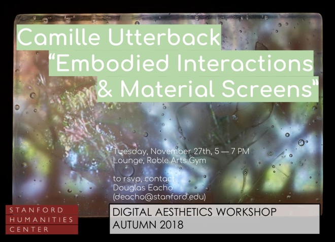
After a refreshing fall break, the Digital Aesthetics workshop will return with sessions on November 27th and December 4th . First up, we are thrilled to host Camille Utterback, Assistant Professor of Art Practice and Computer Science here at Stanford. We have always wanted to host an artist in the workshop, and could not be happier to build a conversation around Camille’s fascinating work and current questions. We look forward to seeing you there – please consider RSVPing so we can supply refreshments appropriately.

Embodied Interactions & Material Screens

w/ Camille Utterback

Tues, Nov 27, Roble Lounge, 5-7

rsvp to deacho at stanford.edu

After an overview of her interactive installation work, Camille will present on current works-in-progress which examine combinations of custom kiln-formed glass and digital animations. Her goal with her new work is to explore the possibilities of dimensional display surfaces that address the subtleties of our depth perception. What can be gained from more hybrid analog/digital and less “transparent” digital surfaces? What is at stake when our display surfaces maintain the illusion of a frictionless control vs an more complex and interdependent materiality? Camille is interested in developing a dialog around this new work, and welcomes a variety of critical input as she attempts to with situate her artworks in a theoretical framework. She has recently been reading Sensorium (ed. Caroline A. Jones), and  Meredith Hoy’s From Point to Pixel.

Camille Utterback is a pioneer in the field of digital and interactive art. Her work ranges from interactive gallery installations, to intimate reactive sculptures, to architectural scale site-specific works. Utterback’s extensive exhibit history includes more than fifty shows on four continents. Her awards include a MacArthur Foundation Fellowship (2009), Transmediale International Media Art Festival Award (2005), Rockefeller Foundation New Media Fellowship (2002), Whitney Museum commission for their ArtPort website (2002), and a US Patent (2001). Recent commission include works for The Santa Cruz Museum of Art and History, Santa Cruz, California (2016), The Liberty Mutual Group, Boston, Massachusetts (2013), The FOR-SITE Foundation, San Francisco, California (2012), and the City of Sacramento, California (2011). Camille’s “Text Rain” piece, created with Romy Achituv in 1999, was the first digital interactive installation acquired by the Smithsonian American Art Museum.

Camille holds a BA in Art from Williams College a Masters degree from the Interactive Telecommunications Program (ITP) at NYU’s Tisch School of the Arts. She is currently an Assistant Professor in the Art & Art History Department, and by courtesy in Computer Science, at Stanford University. Her work is represented by Haines Gallery in San Francisco.

Interactivity and the “Video Essay”

paradoxes-of-suture1

Recently, I posted a video essay exploring suture, space, and vision in a scene from Nicholas Roeg’s Don’t Look Now (1973). Following my video essay hijab.key, which experimented with dirt-cheap DIY production (namely, using Apple’s Keynote presentation software instead of the much more expensive Adobe Premiere Pro or Final Cut Pro for video authoring), the more recent video, “Don’t Look Now: Paradoxes of Suture,” was also an experiment in using splitscreen techniques for deformative purposes, intended to allow the viewer to alternate between “close” (or focused) and “distant” (or scanning, scattered) viewing modes.

What I have begun to realize, however, is that these videos are pushing at the boundaries of what a “video essay” is or can be. And I think they are doing so in a way that goes beyond the more common dissatisfactions that many of us have with the term “video essay” — namely, the questionable implications of (and formal expectations invoked by) the term “essay,” which apparently fails to describe many videographic forms that are either more poetic in nature or that indeed try to do argumentative or scholarly work, but whose arguments are less linear or explicit than those of traditional essays. These are good reasons, I think, to prefer a term like “videographic criticism” (except that “criticism” is perhaps too narrow) or “videographic scholarship” over the more common “video essay.”

But these recent pieces raise issues that go beyond such concerns, I suggest. They challenge the “videographic” part of the equation as much as, or even more than, the “essayistic” part. Take my “Don’t Look Now” video, which as I stated is designed to give the viewer the opportunity to experiment with different ways or modes of looking. By dissecting a scene into its constituent shots and laying them out in a multiscreen format, I wanted to allow the viewer to approach the scene the way one looks at a page of comics; that is, the viewer is free to zoom into a particular panel (which in this case is a looping video clip) and become immersed in the spatiotemporal relations it describes, only then to zoom back out to regard a sequence, row, or page of such panels, before zooming back in to the next one, and so on. Thus, two segments in the recent video consist simply of fifteen looping shots, laid out side by side; they are intended to give the viewer time to experiment with this other, less linear mode of looking.

But the video format itself is linear, which raises problems for any such experiment. For example, how long should such a splitscreen configuration be allowed to run? Any answer will be arbitrary. What is the duration of a page of comics? The question is not nonsensical, as cartoonists can establish rhythms and pacings that will help to determine the psychological, structural, or empirical duration of the reading experience, but this will never be an absolute and determinate value, as it is of necessity in the medium of video. That is, the linear format of video forced me to make a decision about the length of these segments, and I chose, somewhat arbitrarily, to give the viewer first a brief (30 sec.) glance at the multiscreen composition, followed later (after a more explicitly argumentative section) by a longer look (2 min. at the end of the 9 minute video). But since the whole point was to enable a non-linear viewing experience (like the non-linear experience of reading comics), any decision involving such a linearization was bound to be unsatisfactory.

One viewer commented, for example:

“I think the theory is interesting but why the lengthy stretches of multi shot with audio? Irritating to the extent that they detract from your message.”

Two important aspects come together in this comment. For one thing, the video is seen as a vehicle for a message, an argument; in short, it is regarded as an “essay.” And since the essayistic impulse combines with the video medium to impose a linear form on something intended as a non-linear and less-than-argumentative experimental setup, it is all too understandable that the “lengthy stretches” were found “irritating” and beside the point. I responded:

“For me the theory [of suture] is less interesting than the reading/viewing technique enabled by the splitscreen. I wanted to give the viewer time to make his or her own connections/alternate readings. I realize that’s at odds with the linear course of an ‘essay,’ and the length of these sections is arbitrary. In the end I may try to switch to an interactive format that would allow the viewer to decide when to move on.”

It was dawning on me, in other words, that by transforming the Keynote presentation into a video essay (using screen recording software), I had indeed found an interesting alternative to expensive video authoring software (which might be particularly valuable for students and other people lacking in funding or institutional support); at the same time, however, I was unduly amputating the interactive affordances of the medium that I was working in. If I wanted to encourage a truly experimental form of vision, then I would need to take advantage of precisely these interactive capabilities.

DontLookNow-ParadoxesOfSuture-INTERACTIVE-Standalone-2016-02-16.

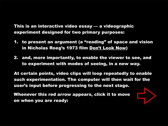
Basically, a Keynote file (like a PowerPoint presentation) is already an interactive file. Usually the interactivity is restricted to the rudimentary “click-to-proceed-to-the-next-slide” variety, but more complex and interesting forms of interaction (or automation) can be programmed in as well. In this case, I set up the presentation in such a way as to time certain events (making the automatic move from one slide to another a more “cinematic” sequence, for example), while waiting for user input for others (for example, giving the user the time to experiment with the splitscreen setup for as long as they like before moving on). You can download the autoplaying Keynote file (124 MB) here (or by clicking on the icon below) to see for yourself.

icon128-2x

Of course, only users of Apple computers will be able to view the Keynote file, which is a serious limitation; ideally, an interactive video essay (or whatever we decide to call it) will not only be platform agnostic but also accessible online. Interestingly, Keynote offers the option to export your slideshow to HTML. The export is a bit buggy (see “known bugs” below), but with some tinkering you can get some decent results. Click here to see a web-based version of the same interactive piece. (Again, however, note the “known bugs” below.)

HTML5_Logo_256

In any case, this is just a first foray. Keynote is probably not the ultimate tool for this kind of work, and I am actively exploring alternatives at the moment. But it is interesting, to say the least, to test the limits of the software for the purposes of web authoring (hint: the limits are many, and there is constant need for workarounds). It might especially be of interest to those without any web design experience, or in cases where you want to quickly put together a prototype of an interactive “essay” — but ultimately, we will need to move on to more sophisticated tools and platforms.

I am interested, finally — and foremost — in getting some feedback on what is working and what’s not in this experiment. I am interested both in technical glitches and in suggestions for making the experience of interacting with the piece more effective and engaging. In addition to the Keynote file and the online version, you can also download the complete HTML package as a single .zip file (66 MB), which will likely run smoother on your machine and also allow you to dissect the HTML and Javascript if you’re so inclined.

zip

However you access the piece, please leave a comment if you notice bugs or have any suggestions!

Known bugs, limitations, and workarounds:

  • Keynote file only runs on Mac (workaround: access HTML version)
  • Buggy browser support for HTML version:
    • Horrible font rendering in Firefox (“Arial Black” rendered as serif font)
    • Offline playback not supported in Google Chrome
    • Best support on Apple Safari (Internet Explorer not tested)
  • Haven’t yet found the sweet spot for video compression (loading times may be too long for smooth online playback)